
Princess Castleberry Visual Rebrand
Objective: To create a rebranded image for Princess Castleberry that aligns with her personality, positioning her as a wise and aspirational speaker.
Strategy: The rebranding strategy for Princess Castleberry aimed to position her as a distinctive and aspirational speaker in the corporate world. Guided by the archetype of a sage with a hint of magic, the strategy focused on aesthetics that incorporated a refined and moody vibe with a touch of sophistication. The chosen mood board, "Sage with a Hint of Magic," featured a unique color palette of magenta, black, gray, and gold, symbolizing wisdom and a touch of enchantment. The new logo and icon maintained consistency while reflecting her refined image, and the selection of sleek sans-serif fonts and signature script fonts struck a balance between professionalism and approachability. Custom social media templates, LinkedIn and Facebook headers, a pitch deck template, and video frames were created to ensure a cohesive and visually appealing brand presence. This strategy successfully rebranded Princess Castleberry, making her stand out and resonate with her audience, positioning her for greater success and recognition in her field.
Results: The rebranding effort resulted in Princess Castleberry having a brand that reflects her personality and unique positioning as a wise and aspirational speaker. She now stands out in the corporate speaking world, with a cohesive brand strategy and visual elements that resonate with her audience. This rebranding has positioned her for greater success and recognition in her field.
DDOT Rebrand Project
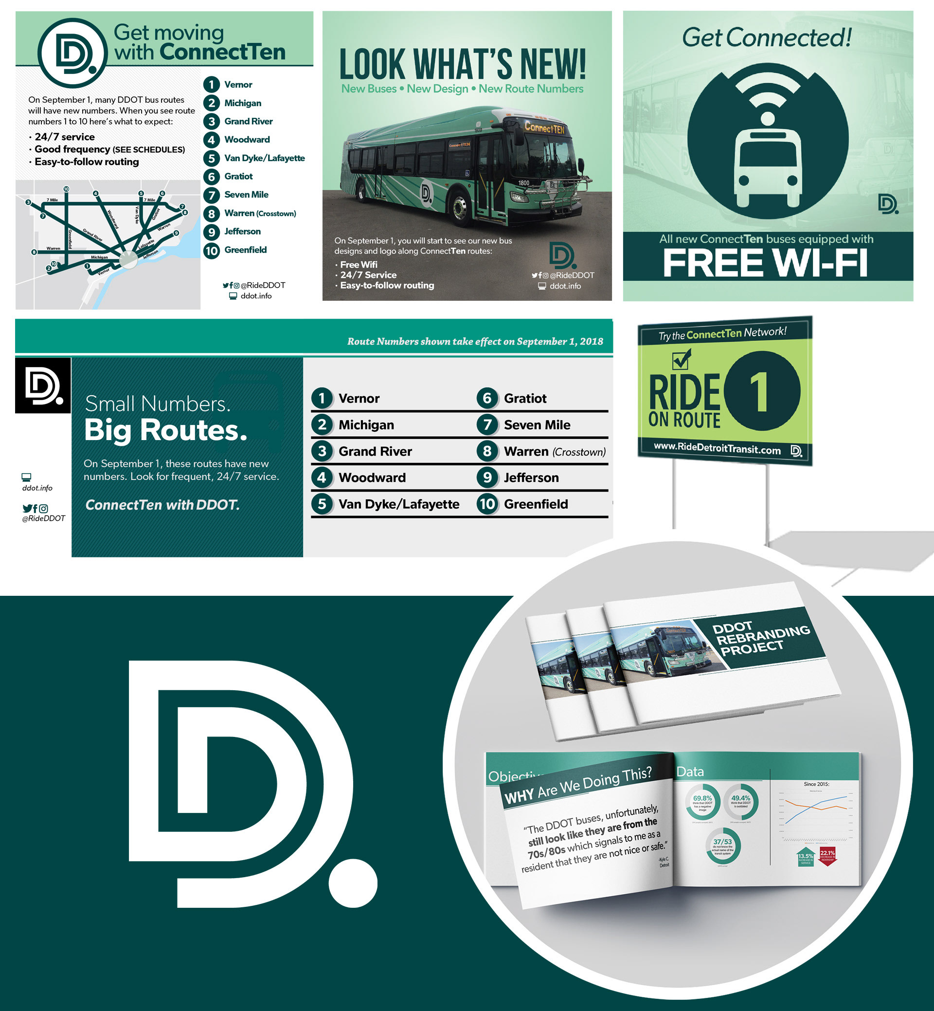
Despite DDOT's significant improvements in service and personnel, our reputation from the 80s persisted. To improve our image, external changes were necessary.
Objective: The project aimed to create a new brand for DDOT, developing new bus designs, a new website, brand guidelines and marketing materials to improve our image. Success would be measured by increased positive social media engagement and ridership.
Strategy: Our team targeted a new demographic of potential riders, including businesses in downtown and midtown Detroit experiencing rapid growth. We developed messaging emphasizing the benefits of public transportation, such as cost savings, environmental friendliness, and affordability compared to car payments, gas, and insurance. Extensive research, including surveys of current riders and consultations with stakeholders and management, helped ensure success. We also analyzed other transit systems and competitors like Uber and Lyft.
Results: The rebranding effort was successful, with increased positive social media engagement and ridership. We positioned DDOT as a reliable transportation option for businesses and potential riders. By focusing on a new demographic of potential riders and emphasizing the benefits of public transportation, we created a brand that resonated with existing and new customers alike.
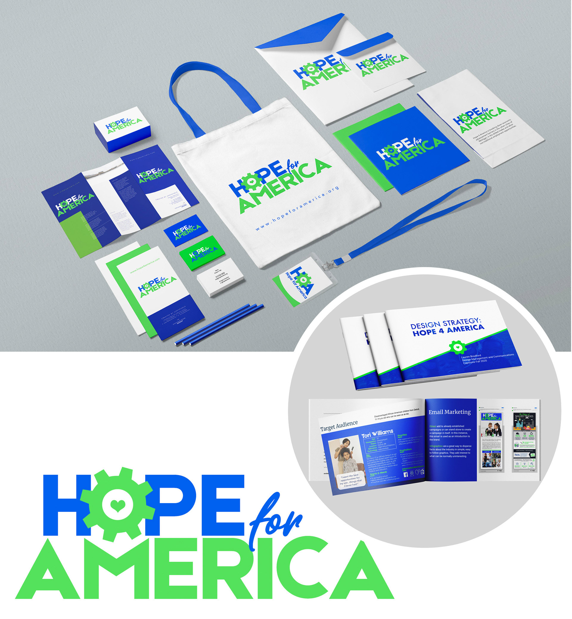
Design Strategy - Capstone Project
Georgetown M.P.S.
Georgetown M.P.S.
Background: For my capstone, I was able to choose any class that I had taken throughout my tenure and create a solution to a problem they were having. This project allowed me to apply the knowledge and skills I gained throughout my degree program to a real-world scenario while also contributing to a meaningful cause.
Objective: Develop a comprehensive design strategy that would help Hope 4 America, a non-profit organization that aims to provide support and resources to underserved communities across the country. Specifically, I aimed to create a visually compelling and emotionally resonant brand identity that would increase awareness and engagement with the organization's mission and services.
Methodology: To achieve this objective, I worked closely with the non-profit's stakeholders to understand their needs, goals, and challenges. I conducted extensive research on the organization's target audience, competitors, and industry trends to inform my design decisions. Based on this research, I developed a design strategy that included a new logo, color palette, typography, and visual language. I also created a comprehensive brand style guide to ensure consistency and coherence across all communications and touchpoints.
Results: The project was a resounding success, as the new design strategy received positive feedback from the non-profit's stakeholders and my professor. The new brand identity was embraced by the organization's members, and it helped to increase awareness and engagement with their mission and services. Overall, the project provided me with an opportunity to showcase my expertise in design management and my ability to lead a project from start to finish.
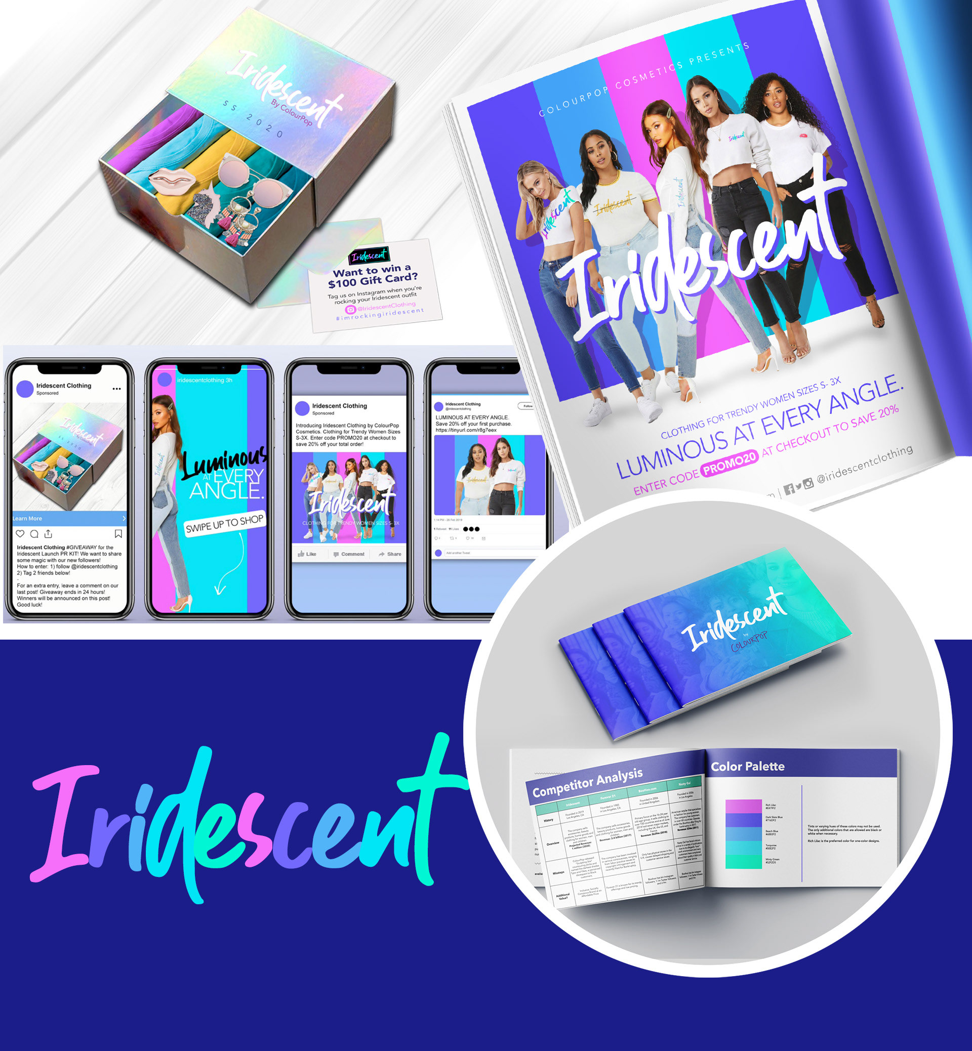
Iridescent by ColourPop:
Brand Extension Strategy
Brand Extension Strategy
Background: I was tasked with developing a brand extension for an existing company that aligned with their brand and values. I chose to create a new clothing brand called Iridescent for ColourPop that would embody the company's social responsibility practices.
Objective: The goal of the project was to create a clothing line that utilized affordable vegan fabrics and targeted stylish Millennial and Generation Z females who are already customers of ColourPop's cosmetics line and shop at stores like Forever 21. I aimed to develop a brand identity, design strategy, and marketing campaign that would successfully launch the new product.
Methodology: I conducted extensive research on the target audience, competitors, and industry trends. Using this information, I developed a design strategy that included a new brand identity and guidelines, a creative marketing strategy, and campaign deliverables for the launch of Iridescent. I also created a promotional campaign that would generate excitement and interest among ColourPop's existing and potential customers.
Results: The Iridescent brand successfully embodied ColourPop's social responsibility practices and values. The new clothing line disrupted the status quo and generated buzz among ColourPop's existing customers and potential new customers. The project also helped me develop valuable skills in brand development, design strategy, and marketing campaign planning.
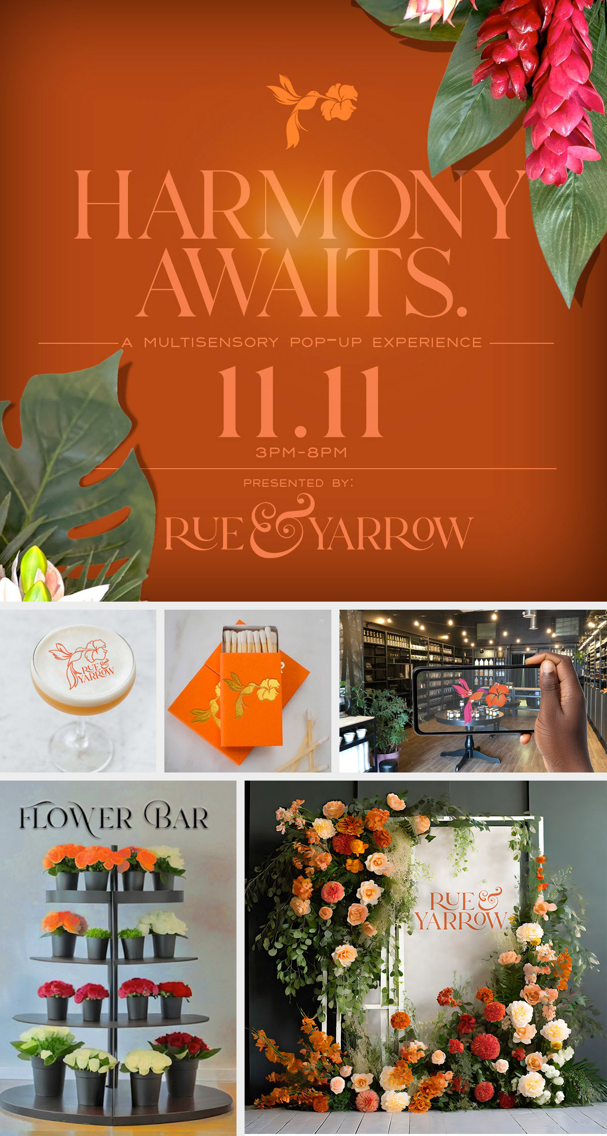
Interactive Experiences/Workshops
Background: Rue & Yarrow, a luxury home decor and fragrance brand, initiated a brand activation event to introduce its distinctive products to multicultural women aged 35-44. The brand's mission, centered on empowerment and mindfulness, set the stage for an immersive experience designed to resonate with the target audience.
Objective: The primary objective of the event was to create a memorable multisensory experience that aligned with Rue & Yarrow's values, fostering brand awareness and engagement. Specific goals included showcasing products, acquiring email addresses for future marketing efforts, and establishing a strong emotional connection with attendees.
Methodology: The event, themed "Harmony Awaits: A Multisensory Journey," incorporated various elements to achieve its objectives. A visually captivating floral installation, a fragrance-inspired custom cocktail bar, and a flower bar for personalized bouquets added a tactile and olfactory dimension. Guerrilla marketing, QR codes, and an AR scavenger hunt infused technology, while social media campaigns, influencer collaborations, and email marketing formed the digital backbone.
Technology tools such as a mobile app, integrated payment gateways, and CRM systems were deployed for seamless operations. Post-event initiatives included a follow-up campaign with exclusive offers, user-generated content promotion, and the launch of a customer loyalty program.
Results: The brand activation event yielded positive outcomes for Rue & Yarrow. Increased brand awareness was evident, with the acquisition of valuable email addresses for future engagement. The multisensory approach successfully established a strong emotional connection with attendees, setting the stage for potential brand advocates and loyal customers. Online and offline strategies complemented each other, showcasing Rue & Yarrow's commitment to uniqueness and creating a foundation for sustained growth in the luxury home fragrance market. Future considerations involve ongoing social media engagement, loyalty program expansion, and continued innovation in experiential marketing.
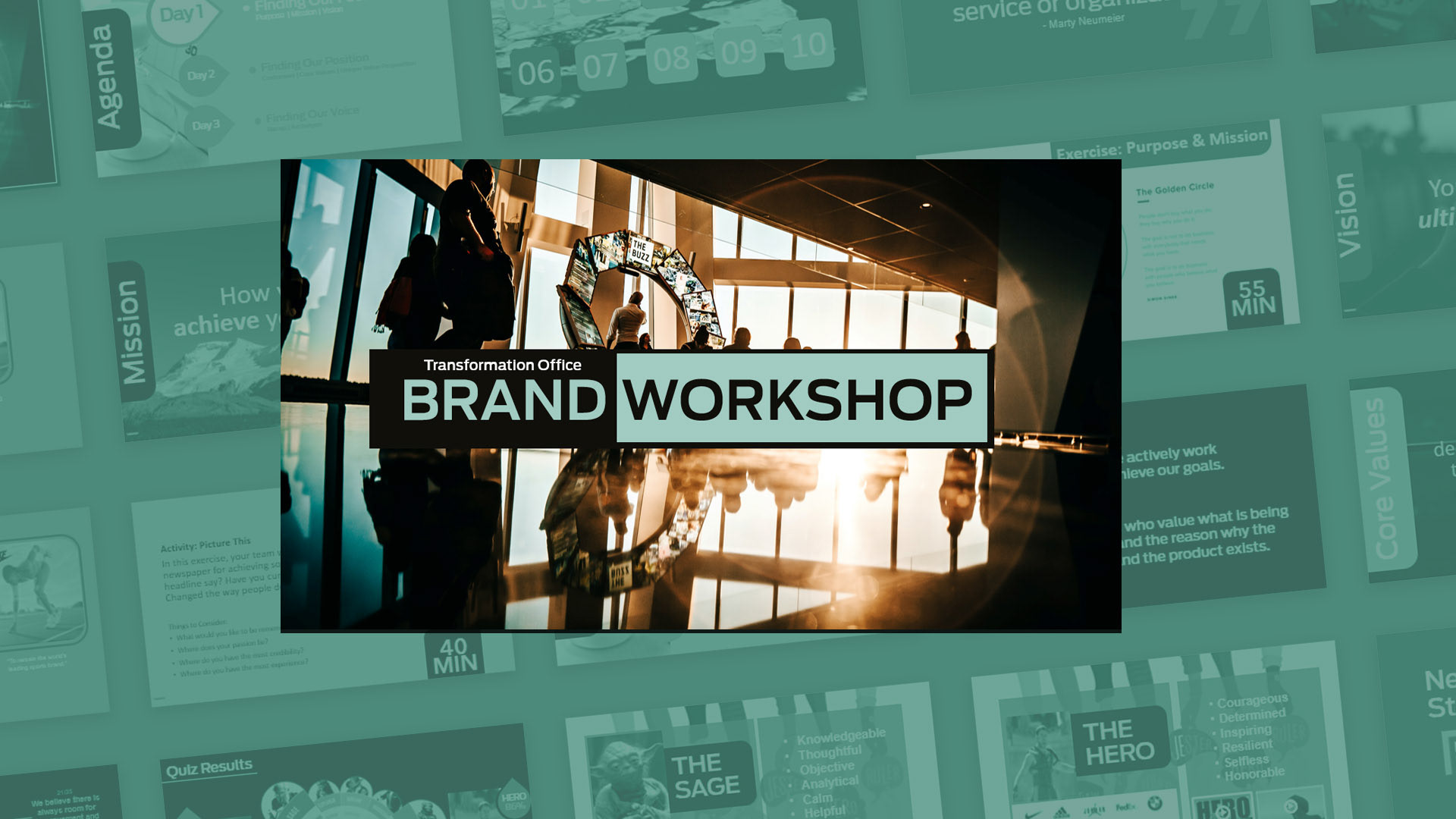

TO Brand Workshop
Objective: Defining the Purpose and Evolution of the Transformation Office for the Future
Solution: Serving as the lead facilitator, I designed and conducted a comprehensive virtual brand workshop for The Transformation Office. The workshop aimed to establish a clear vision, mission, purpose, unique value proposition, core values, and brand archetype for the team. Leveraging interactive activities and engaging video tutorials, the workshop fostered collaboration and enabled the team members to gain deeper insights into each other's perspectives, ultimately aligning their efforts towards a unified purpose.
Results: The brand workshop proved instrumental in charting a strategic roadmap for future growth and development within The Transformation Office. By clearly articulating their mission and leveraging their unique value proposition, the team members were empowered to deliver added value to the organization. Moreover, the workshop facilitated a shared understanding of purpose and direction, equipping the team with the ability to adapt, evolve, and innovate in response to the evolving needs of the organization.
This brand workshop provided a transformative experience, enabling The Transformation Office to strengthen its position as a driving force in the industry while establishing a solid foundation for continued success.
Ford Labs Brand Refresh
Client: FordLabs, UI/UX design team
Objective: To create a new brand direction for Ford Labs, overcoming communication issues and a perceived sense of arrogance.
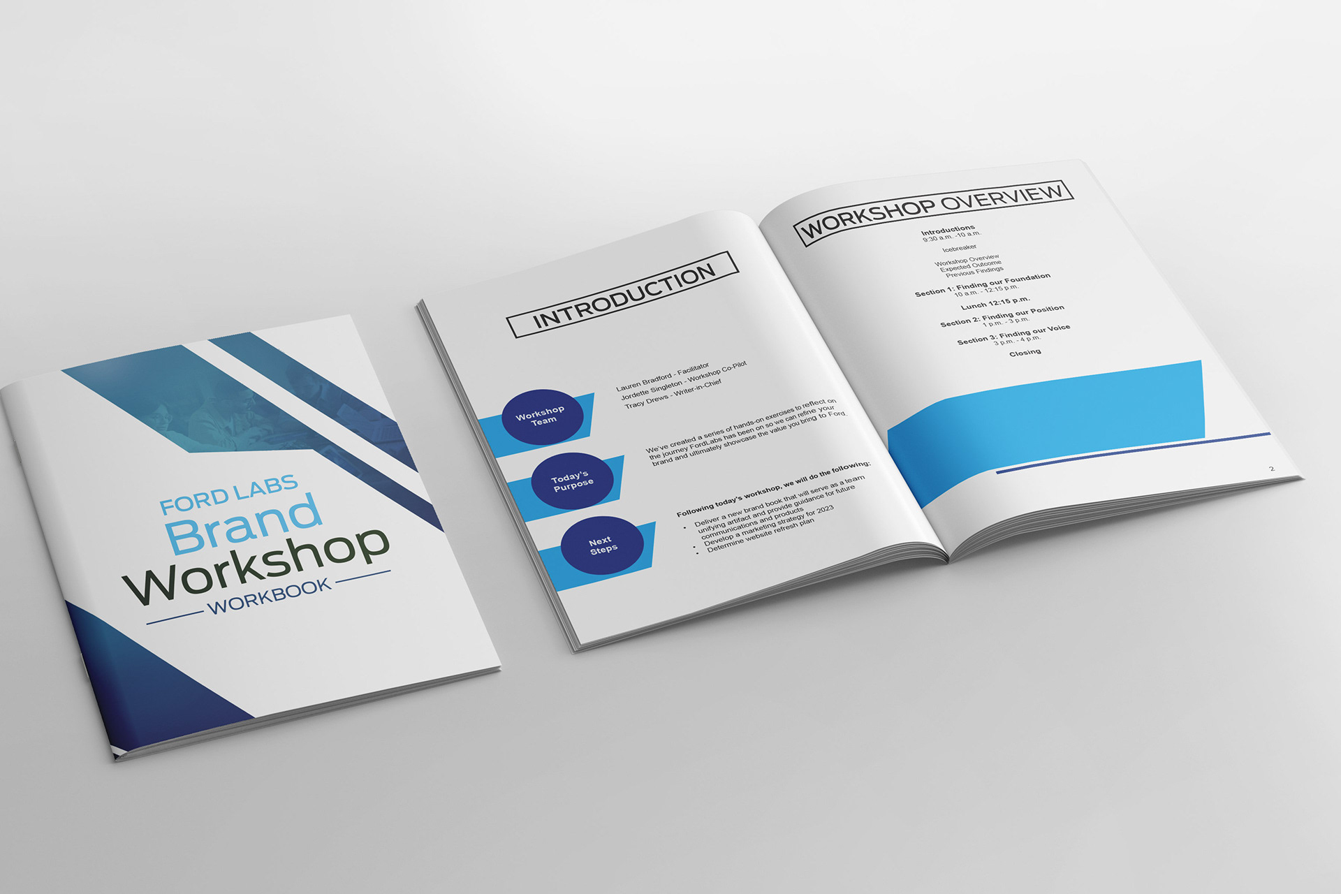
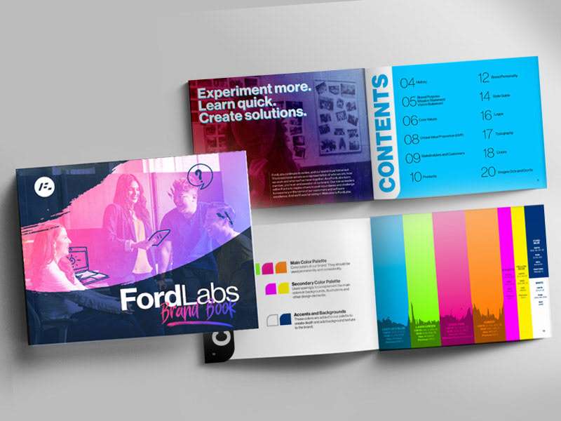
Solution: As a designer and facilitator, my role was to develop and lead an in-person Brand Workshop that would guide the team through a series of activities to identify their vision, mission, purpose, unique value proposition, core values, and brand archetype. The workshop was designed to be engaging and interactive, with activities that encouraged team members to collaborate and share their ideas.
As the lead facilitator, I ensured that the workshop ran smoothly and that the team was able to fully participate in the activities. I also provided guidance and support throughout the process to ensure that the team stayed focused and on track. Post-workshop, I collaborated closely with the team writers to develop the content for the brand book, which I also designed. This allowed me to ensure consistency between the visual and written aspects of the brand, creating a cohesive and impactful brand identity.
Results: The outcome of the workshop was a clear set of brand guidelines that helped the Ford Labs team to refresh their brand identity. The team was able to communicate their new brand direction effectively, which helped to increase brand awareness and improve customer engagement. By addressing the previous communication issues and perceived arrogance, the new brand identity positioned Ford Labs as a confident and approachable leader in the UI/UX design space.
Overall, the Brand Workshop was a successful initiative that helped Ford Labs to define their brand purpose and values, and create a cohesive and impactful brand identity that resonated with their customers.